-
- HOME
- ABOUT US
- SOLUTION
- PROJECTS
- INDUSTRIES
- CLIENT NETWORK
- CAREER
- CONTACT WooCommerce not Found
- Newsletter
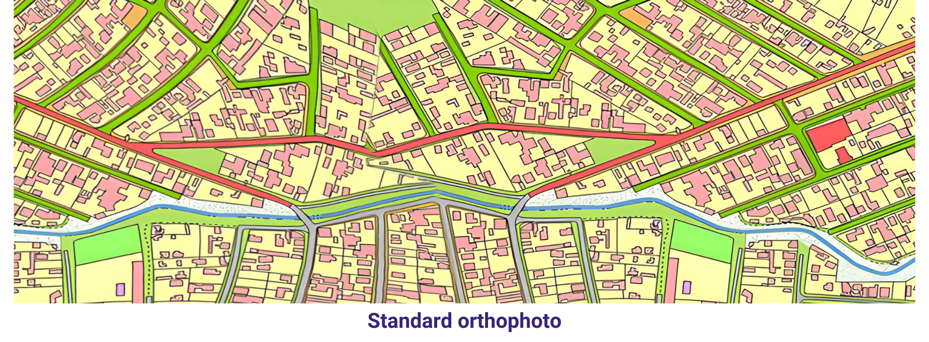
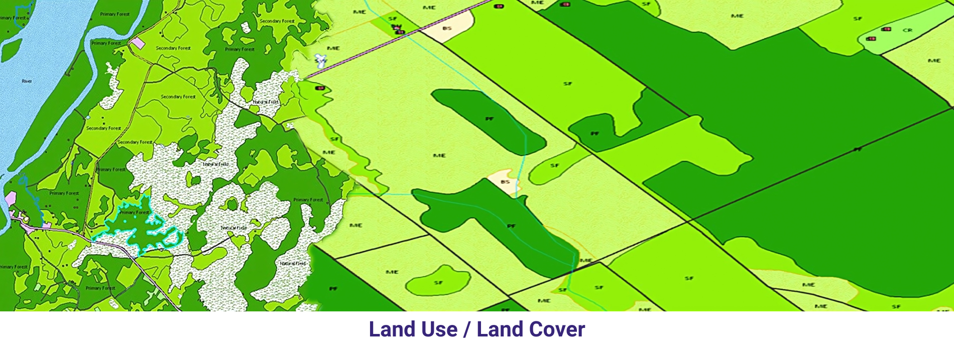
Provided Orthophotos were downloaded and 2D sample cartographic map has been prepared with visible features on the Orthophoto. We have selected a sample pilot area from 4 Orthophoto (refer the sample DGN file and Screen capture). Different features have been restituted using Microstation software and the final file is in DGN format.
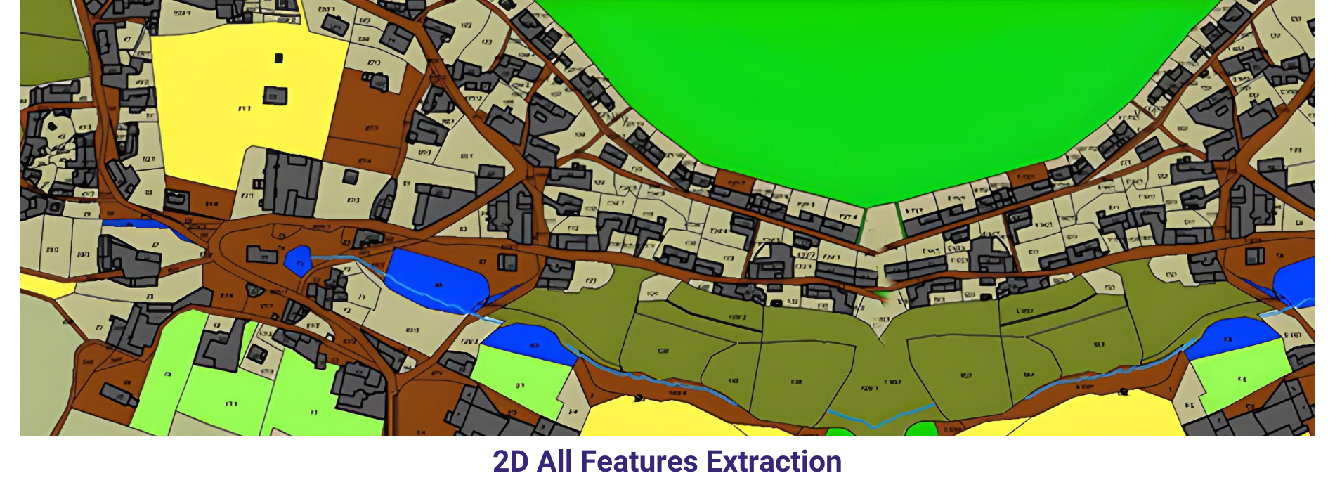
Different types of roads like Highways, primary roads and local roads has been captured by following cartographic rules like paralallity and center lines for major roads also represented. Footpaths have been represent with different symbology. Paint lines of directions have been represented.
Buildings and Urban lots have been represented using different layers and also followed the cartographic rules like orthogonolity and clockwise direction while in digitization of each and every feature. Generic construction areas also been represented in this sample map. Buildings and urban lots
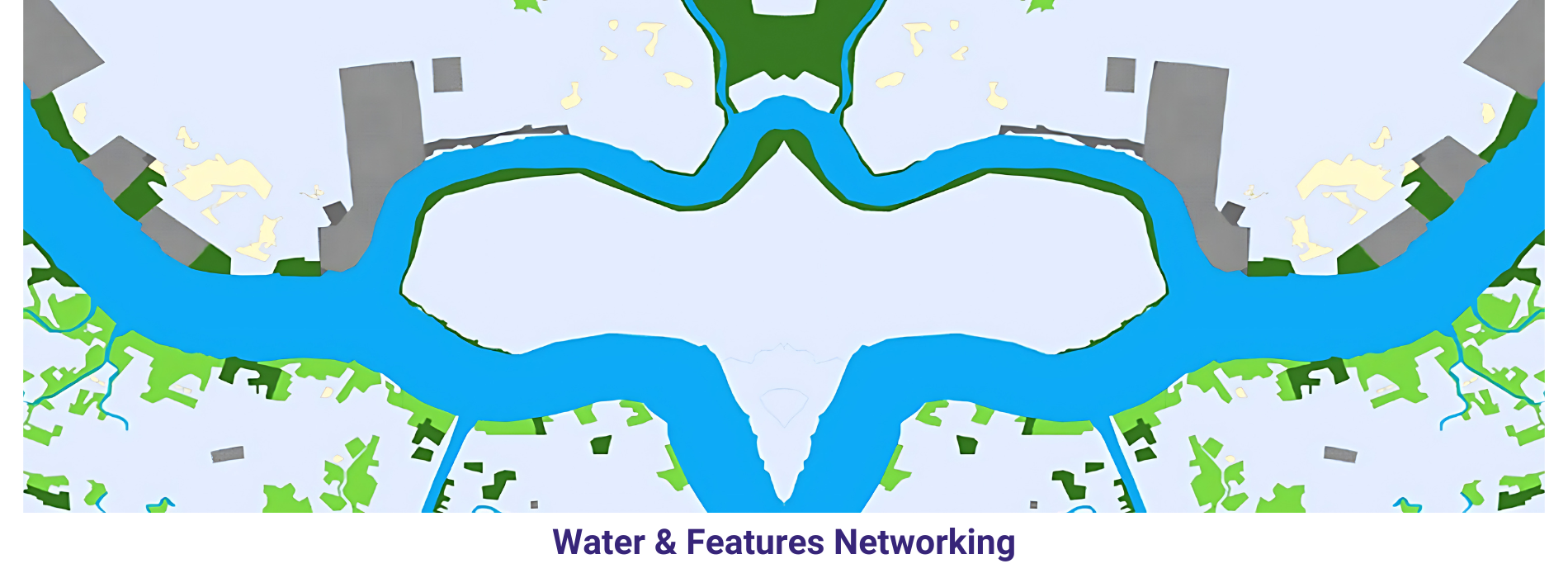
Vegetation areas have been represented by delineating them in to different categories like grassland, irrigation crop, Dry crop and thicket. We also represented some utilities like street lights. Isolated tree also have been represented by using relevant symbols.
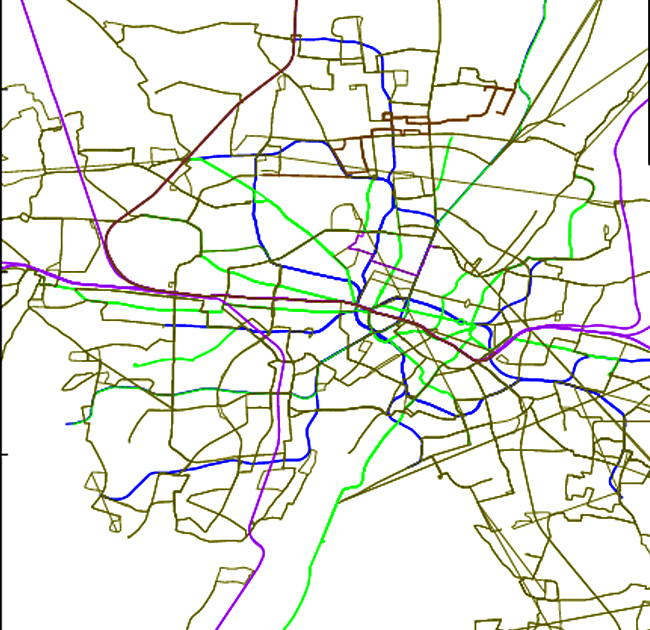
Mapping a metro rail network involves creating a detailed representation of the rail lines, stations, and other infrastructure. This can be a complex task, but with the right tools and techniques, it can be done efficiently and accurately
Remember that mapping a metro rail network is an ongoing process that requires regular updates and maintenance to remain accurate and useful. It’s also important to involve stakeholders throughout the mapping process to ensure that the final product meets their needs and expectations.
Mapping a road network involves creating a detailed representation of roads, streets, highways, and other transportation infrastructure within a geographic area.
By following these steps, you can create a comprehensive and accurate map of a road network that serves as a valuable tool for transportation planning, infrastructure management, and spatial analysis.
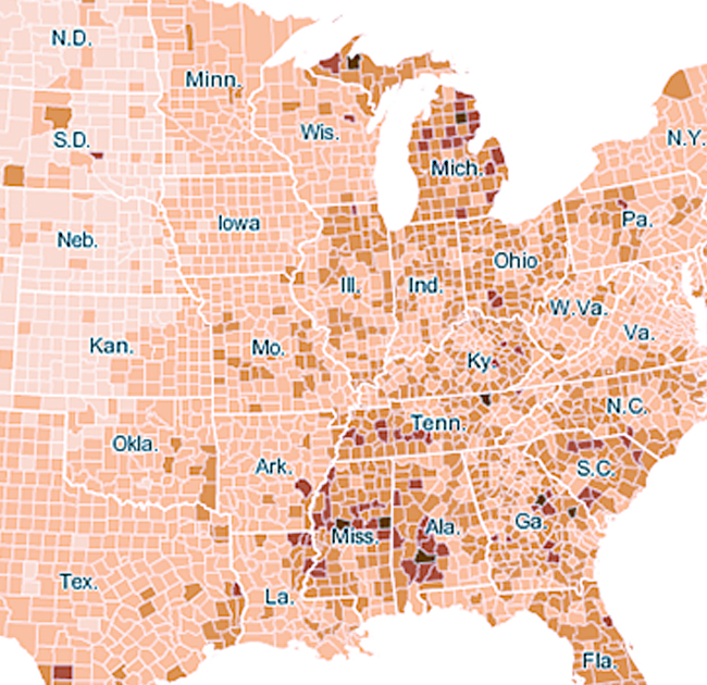
A choropleth map is a thematic map that uses color, shades, or patterns to represent a geographic area based on a statistical value. The term “choropleth” comes from the Greek words “choro” meaning area and “pleth” meaning fullness, referring to the proportional fill of the area.
Choropleth maps are widely used in geography, sociology, economics, and political science to visualize data that can be associated with administrative boundaries or other pre-defined areas. They are particularly useful for comparing regions and identifying spatial patterns in the data.
However, it’s important to note that choropleth maps can sometimes be misleading due to the issue of spatial heterogeneity within the defined areas. For example, a county with a high population density might have pockets of lower density, or the distribution of the population within the county might be uneven. In such cases, alternative mapping techniques, such as dot density maps or isopleth maps, might be more appropriate.
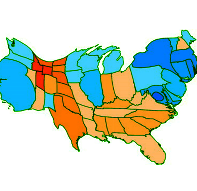
A cartogram is a map-like diagram that distorts the size or shape of geographic areas to represent data values. The purpose of a cartogram is to visualize relationships between spatial entities and some quantitative data, such as population, Gross Domestic Product (GDP), or any other variable that can be mapped to a spatial unit.
Cartograms are useful for communicating information about spatial distributions of data in a way that is not possible with traditional maps. They can help to highlight the importance of certain areas that might be overlooked on a standard map due to their small size or remote location.
However, cartograms can be difficult to interpret in terms of traditional geographic relationships, such as distance and direction. They also do not provide information about the actual size or shape of the geographic areas, which can be important for certain types of analysis.
Cartograms are often used in journalism, policy analysis, and research to communicate complex spatial data in a visually compelling way. They can be created using specialized software or by manually adjusting the size and shape of geographic areas in a geographic information system (GIS).
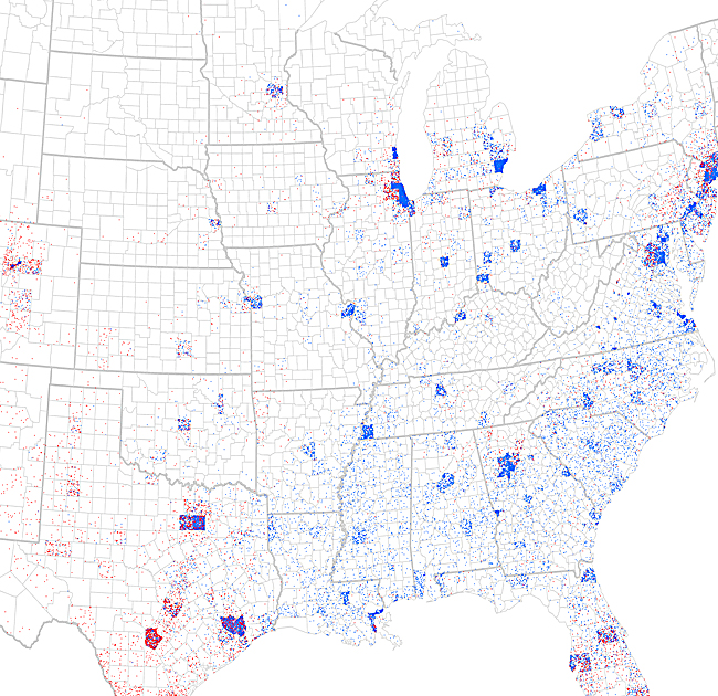
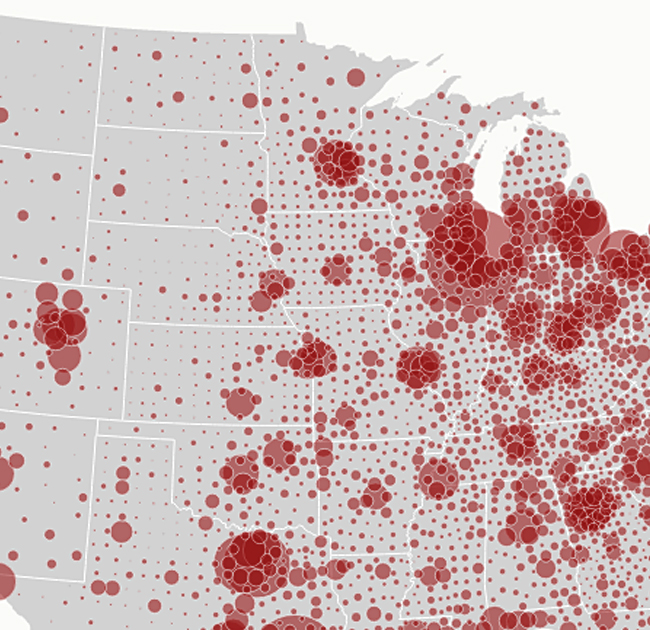
A dot density map is a thematic map that uses dots of uniform size to represent a quantity or a density of a phenomenon. The dots are placed over a geographic area, and their density or aggregation is proportional to the value of the phenomenon being mapped. This technique is often used to represent data that can be associated with a specific location, such as population, crime incidents, or disease cases.
However, dot density maps can be misleading if the dots are not distributed evenly within the geographic areas. For example, if the dots are concentrated in one part of a census block, this might not accurately reflect the distribution of the phenomenon across the entire block.
In addition, dot density maps can be difficult to interpret if the density of dots becomes too high, as it can be hard to distinguish individual dots. In such cases, other mapping techniques, such as proportional symbol maps or graduated symbols, might be more appropriate.
Dot density maps are often used in urban planning, public health, and social science research to visualize the distribution of population, crime, and other phenomena across geographic areas. They can be created using specialized software or by manually placing dots on a map.
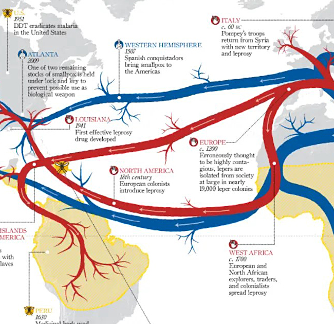
A flow map is a type of diagram that is used to visualize the flow of data between different locations or origins and destinations. Flow maps are often used in geography, economics, and social science to understand and analyze the movement of people, goods, information, or resources over space and time.
Flow maps are useful for understanding the spatial patterns and dynamics of movement and exchange. They can help to identify key trade partners, understand the impact of trade on different regions, and identify potential areas for economic development or trade diversification.
However, flow maps can be difficult to interpret if there are too many flows or if the flows are too complex. They also require a significant amount of data to be effective, and the accuracy of the map depends on the quality and completeness of the underlying data.
Flow maps can be created using a variety of software tools, including ArcGIS, QGIS, and Tableau. They can be displayed on a computer screen, printed on paper, or even created as physical models using 3D printing technology.
Graduated symbol maps, also known as proportional symbol maps, are a type of thematic map that uses symbols of varying sizes to represent the magnitude or quantity of a variable at specific geographic locations. These symbols are typically circles, squares, or other shapes, and their size corresponds to the value of the variable being mapped.
Graduated symbol maps are commonly used in demography, economics, environmental science, and other fields to visualize and analyze spatial patterns and variations in data. They provide a clear and intuitive way to represent quantitative information at specific geographic locations, allowing viewers to identify spatial trends and disparities in the data.
A network map is a type of diagram that is used to visualize the structure and connections within a network. Networks can be physical, such as road networks or electrical grids, or they can be social, such as friendship networks or business partnerships. Network maps are used to understand how nodes (individual elements within the network) are connected to each other, and how the structure of the network affects the flow of information, resources, or people through the network.
However, network maps can be difficult to interpret if the network is too large or too complex. They also require a significant amount of data to be effective, and the accuracy of the map depends on the quality and completeness of the underlying data.
In addition, network maps can be misleading if the relationships between nodes are not represented accurately or if the map does not include all of the relevant relationships. It is important to use a consistent and intuitive method for representing the relationships between nodes to avoid misunderstandings.
Network maps can be created using a variety of software tools, including ArcGIS, QGIS, and specialized network analysis software such as Gephi or Cytoscape. They can be displayed on a computer screen, printed on paper, or even created as physical models using 3D printing technology.
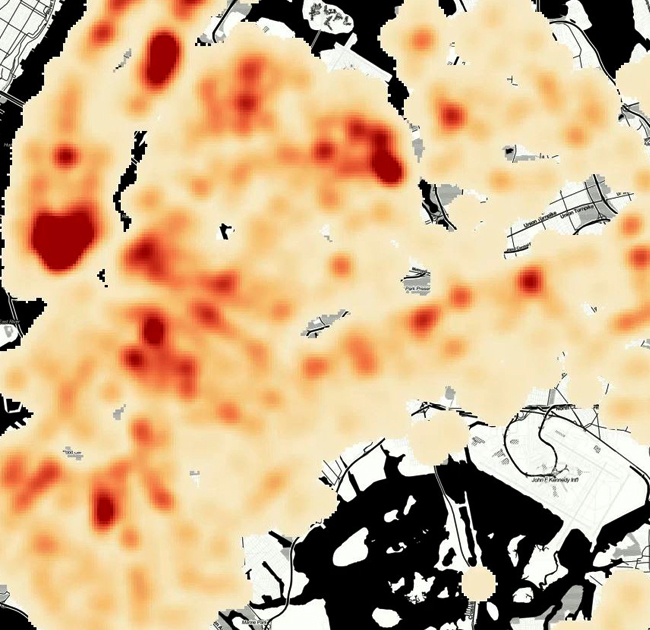
Thermal maps, also known as heat maps, are graphical representations of data where values are depicted using colors to indicate intensity or concentration levels across a geographic area. These maps are commonly used to visualize and analyze data patterns such as population density, temperature variations, or the distribution of a particular phenomenon.
Thermal maps or heat maps are beneficial for identifying trends, outliers, and spatial patterns within datasets. They provide a quick and intuitive way to comprehend data distributions across a geographic area. However, it’s crucial to note that heat maps are visual aids and can sometimes oversimplify complex data relationships.
When using thermal maps, it’s important to consider factors such as color choices, scale ranges, and the underlying data quality to ensure accurate and meaningful representations. Thermal maps are widely used in fields like business analytics, urban planning, epidemiology, and environmental studies to analyze and communicate spatial data effectively.
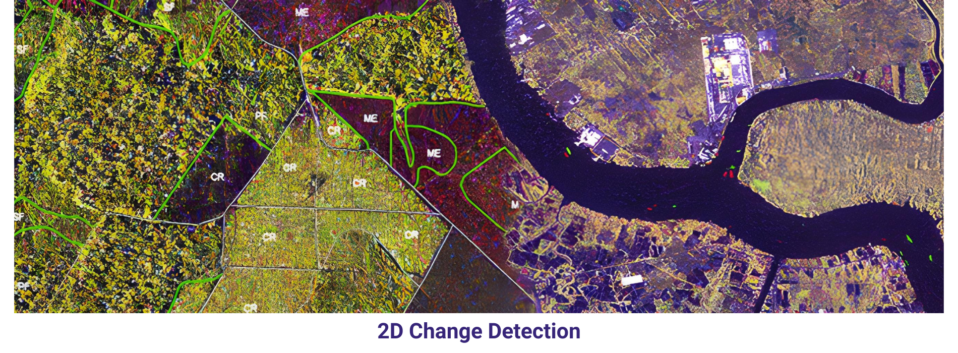
Land cover classification is the process of categorizing and mapping the different types of land cover or land use within a geographic area. It involves identifying and labeling the various surface cover types, such as forests, urban areas, water bodies, agricultural fields, and barren land, among others. Land cover classification is an essential task in remote sensing, GIS (Geographic Information Systems), and environmental monitoring, providing valuable information for resource management, land use planning, biodiversity conservation, and climate change studies.
Land cover classification plays a crucial role in various applications, including natural resource management, environmental monitoring, land use planning, disaster management, habitat mapping, and climate change analysis. It provides valuable insights into the spatial distribution and dynamics of land cover types, helping stakeholders make informed decisions and policies for sustainable development and conservation efforts.
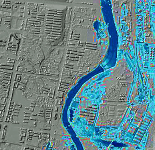
Flood mapping is the process of creating visual representations of areas that are at risk of flooding. These maps are used by governments, insurance companies, and individuals to assess the potential impact of floods and to develop strategies for flood prevention, mitigation, and response.
Flood maps can be created using a variety of data sources, including historical flood records, topographic maps, and satellite imagery. They can also incorporate information about land use, soil type, and other factors that affect the likelihood and severity of flooding.
Flood maps are an important tool for managing the risk of floods. They can help to protect lives and property by providing information that is used to make informed decisions about flood prevention, mitigation, and response.
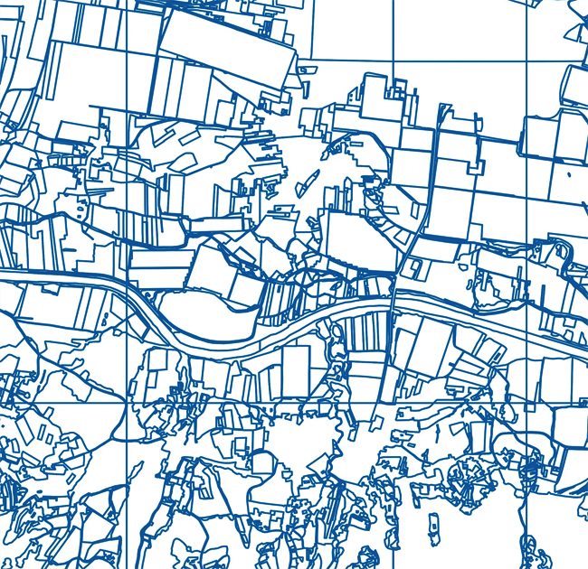
Parcel mapping refers to the process of creating a visual representation of land parcels, typically for use in real estate, urban planning, and property management. It involves the delineation of individual land parcels on a map, along with associated information such as parcel boundaries, owner names, property identification numbers (PINs), acreage, zoning classifications, and other relevant data.
Parcel maps can be created in various formats, including paper maps, digital maps, and interactive web-based maps. Digital maps are particularly useful because they can be easily updated and shared, and they often integrate with other types of geographic data, such as aerial imagery and topographic maps.
In summary, parcel mapping is a critical component of land management and planning, providing a detailed and accurate representation of land parcels that is essential for a wide range of applications.